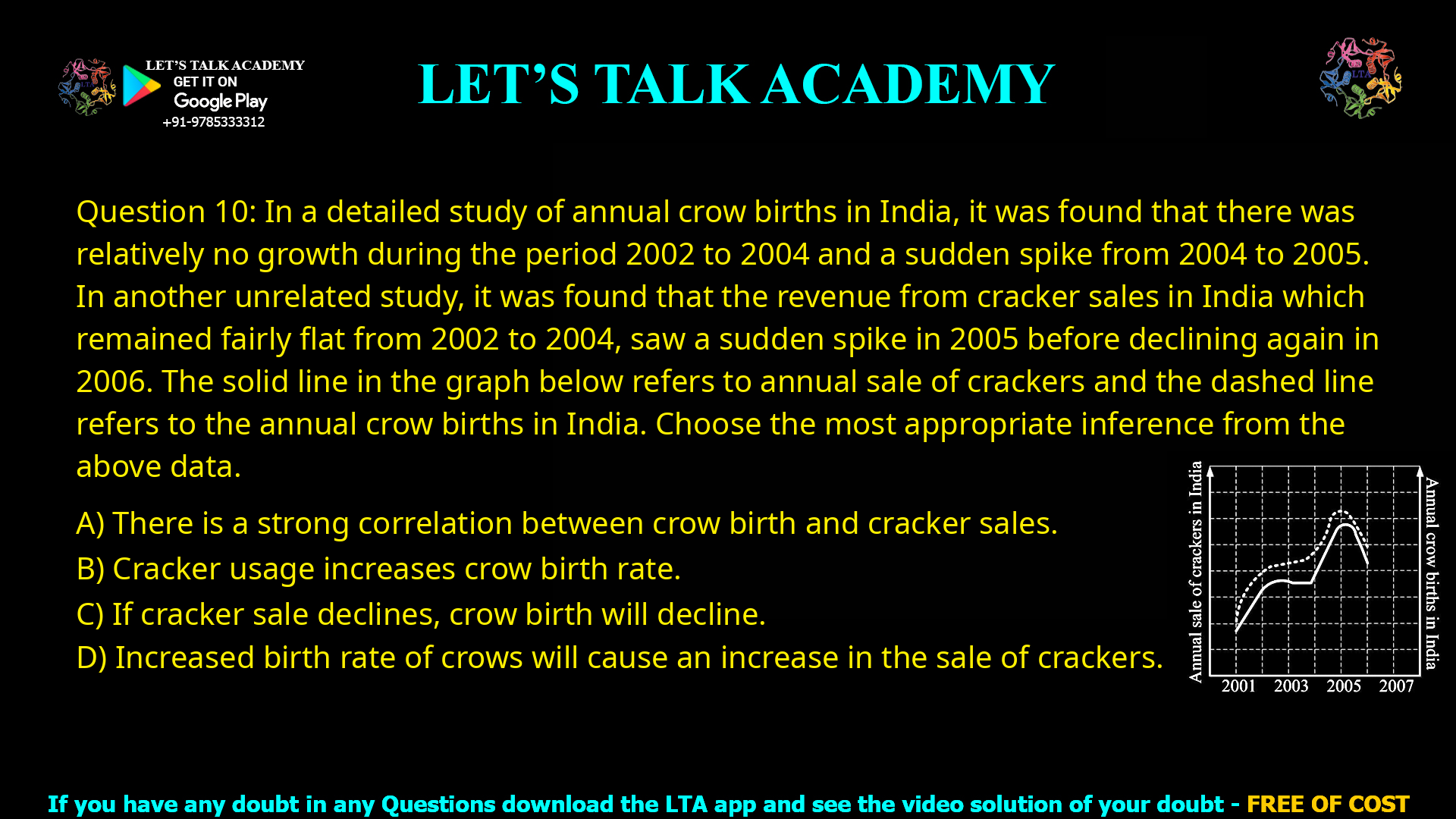
Q.10 In a detailed study of annual crow births in India, it was found that there was relatively no
growth during the period 2002 to 2004 and a sudden spike from 2004 to 2005. In another
unrelated study, it was found that the revenue from cracker sales in India which remained
fairly flat from 2002 to 2004, saw a sudden spike in 2005 before declining again in 2006.
The solid line in the graph below refers to annual sale of crackers and the dashed line refers
to the annual crow births in India. Choose the most appropriate inference from the above
data.
(A) There is a strong correlation between crow birth and cracker sales.
(B) Cracker usage increases crow birth rate.
(C) If cracker sale declines, crow birth will decline.
(D) Increased birth rate of crows will cause an increase in the sale of crackers.
Strong Correlation Between Crow Births and Cracker Sales: Data Interpretation Solved
⭐ Introduction
Many competitive exams test your ability to interpret data and draw correct conclusions. In this problem, we are given:
- One graph showing annual cracker sales in India (solid line)
- Another showing annual crow births in India (dashed line)
- Both show similar trends between 2002–2006
The task: Identify the most reasonable inference based solely on the graph.
This is a classic cause vs correlation trap—only careful reading reveals the right answer.
📊 Understanding the Given Data
Observations from the graph:
| Year | Crow Birth Trend | Cracker Sales Trend |
|---|---|---|
| 2002–2004 | Almost flat | Almost flat |
| 2004–2005 | Sharp increase | Sharp increase |
| 2005–2006 | Decline | Decline |
➡️ Key Insight: Both variables move together — rise, flatten, and fall in matching patterns.
But the graph does NOT tell us:
- Why this happens
- Which event causes the other
- Whether any variable influences the other
It only shows they change in similar directions.
🏆 Correct Answer — Option (A)
This is the only option supported by the graph:
- When crow births rise, cracker sales rise
- When crow births fall, cracker sales fall
- Both spike in 2005
This shows correlation — meaning the two variables behave similarly over time. However, correlation does NOT prove causation.
❌ Why the Other Options Are Wrong
✘ Option (B) Cracker usage increases crow birth rate
Problem: This suggests crackers cause more crow births.
Why Wrong: The graph does not provide cause-effect evidence. Could be coincidental or influenced by a hidden factor.
✘ Option (C) If cracker sale declines, crow birth will decline
Problem: This assumes a cause-effect relationship.
Why Wrong: The graph only shows they happened together, not that one depends on the other.
✘ Option (D) Increased birth rate of crows will cause an increase in the sale of crackers
Problem: Again, this is causation.
Why Wrong: Nothing in the graph indicates that crows influence cracker demand.
➡️ Summary of Wrong Choices
All three wrong choices assume causality, which the graph never proves.
🧠 Key Learning
Graphs like this often trap students into assuming one variable causes another.
But unless explicitly stated, the only valid inference is correlation, not causation.
🎯 Final Conclusion
The data clearly shows that:
- Both cracker sales and crow birth rates follow a similar pattern
- They are rising and falling together
Therefore, the most appropriate inference is:
🟩 (A) There is a strong correlation between crow birth and cracker sales


